Way back in 2022, I had this exchange with Nigel Robinson, who wrote,
"Alexis, I usually comment as Nigli, but I'm on a shared tablet so I have a different handle. I'm from New Zealand originally but have spent most of my adult life in Europe, mostly in the Czech Republic and more recently in Hamburg, Germany.In passing, I am interested to note you used Gottwaldov for what's now Zlin."
He added when I asked,
"Duchy of Vlachia sounds like a reasonable name. I know it as Valašsko, which is the current Czech name. The people there speak with a really sing-song dialect."
Well, Nigel, here's Zlin at last.
Friday, June 19, 2026
For Nigel Robinson
Saturday, June 6, 2026
Such Fun
Haven't put this up for awhile. This is my whole 6.67-mile scale world, up to date for today.
So yes, large. I like that it gives in this scale an interesting pattern of the highest civilised island (tan with red lines), relatively civilised places (orangish) and various shades of green for the rest of the world. The whitish areas, on the other hand, lack lines and represent non-arable lands of the Russian Steppe or the Adriatic-facing karst. That white is going to increase as I get further east, as large tracts of land become too dry to farm. Looking forward to it, since mapping those areas should be rapidly done, much expanding the designed size.
For those not following my map blog, I'm working on the upper right corner presently. More notes about my mapmaking plans and efforts can be read there.
Wednesday, August 13, 2025
A Cross-section of Albania and Macedonia
You can find the complete version of this map here.
Tuesday, April 8, 2025
Abkhazia
Monday, March 24, 2025
Archangel Updated
Archangel is completed. Thicker maps indicate reliable, posted, defined borders; dotted lines show undefined, "soft" borders through wilderness. Added to the wiki page, where the map shows up better.
Wednesday, February 7, 2024
6-mile map of Europe to Date
I'll continue with Ternketh soon. First, as I've just created this amalgamation, I'd like to share it. First, I'll post this image showing the individual map parts:
The size of the image above, with each map at 50% of full scale, was 99 inches by 68, or a width of 20,000 pixels. I was forced to shrink the map down to 2500 pixels, so naturally much of the detail is hopelessly lost. Putting the map together did compress this somewhat.
Here is the map put together:
I made this a little larger, 3000 pixels across. The outlier on the top is an area of the Ukraine, 40 mi. south of Kiyev, that I was asked to create by a patreon supporter who was living there.
The map looks a little odd because it has been stretched differently from a Mercator projection. My projection is more oriented east to west, while most map projections focus north and south. The large blue line is obviously the Danube.
The little gap on the right hand side is where I'm working presently.
Now, on blogger, the detail is obviously obscured. But I was able to make a 300 dpi version of this map for my desktop. In size, as a png, it's 156 mb. I also rendered it as a pdf, also in 300 dpi; the pdf is 60.9 mb. It is a thing of absolute beauty, as the whole map can be zoomed in with perfect clarity. Here's a screenshot from the pdf to demonstrate.
I can't make the pdf available on blogger, but I have posted it to my patreon. It represents a lot of work, however, so I'm making it available only to those who are presently giving a $10 donation. Like all my work, it's in a state of constant development ... but also like all my work, what I call "development" is a bit higher than most of what's available.
If you want to see it, kick in $10 for one month. Why not?
Thursday, September 1, 2022
Map, Aug 31st, 2022
Friday, August 12, 2022
The Mapping Goes On
The above image comes from my Google Earth Pro, with each rectangle being 40 mi. by 20, or 64 by 32 km. In making the map piece by piece, I take it's equivalent from the map above in order to get the right placement of mountains or rivers ... with personal adjustments. Blue rectangles are places I haven't drawn maps for, but which I've outlined in order to get the coastlines "right."
The reader can see the definite curve that's emerging as I steadily add to the map surface. I have to make adjustments for it ... but these are so small that they can't be seen except by persons who are personally acquainted with the areas I'm mapping. For me, the adjustments seem huge, because working at the scale of 6.67 mi. per hex really makes them stand out. The scale for my hex map is 1:422,611, for those who care to know.
With regards to publishing the new map each month, I've decided to adjust my method. Instead of going around in a 40 mile wide circle, I've decided to make that circle 120 miles wide. This is why, on the left, you can see that I've jumped out three full rectangles into Bosnia-Herzegovina and Croatia. I'm just starting into central Hungary. I'm not going to reach either Lake Balaton or Budapest with this go around ... but if I maintain this pace, I'm sure to get there in 3-4 months. It's been fascinating working my way through Serbia and Bosnia; the northern part of Serbia is called Voivodina, which I've just finished in the last few days.
Anyway, I should be able to produce maps of "what's new" more easily, as I'm not going all the way around the map each month.
This is something I tend to do late in the evening, as a relaxation while listening to podcasts, the news or audiobooks. I can do one or two rectangles a night (it's August 12th and I've finished 22 rectangles this month), with a slow steady gain week by week. After so many of these now, it's fairly routine, a bit like working on a colouring book, though there are strange places that offer a challenge. Here's the merging of the Danube and Drava rivers in Slavonia, surrounding the large city of Osijek, where the rivers form a regional swamp:
The land bridge that allows the road to pass from Osijek to Sombor is narrower than the map shows, but does exist in reality. I like the prospect of players having to arrange to put themselves on two ferries (the rivers are too large for a bridge) in order to get across, surrounded by traders who take this route regularly. Both Osijek and Sombor are important market cities, acting as transhipment points up and down both the Drava and Danube rivers as well ... since both rivers are navigable at this point. Squeezing in the details while producing a clear, pretty map is something I did last Thursday, on a day when I did about half a dozen rectangles.
So, I'll return to the main topic again with the next post. It's brutally hot here today and I think I'll take a shower and cool off.
Sunday, July 31, 2022
Map, July 31, 2022
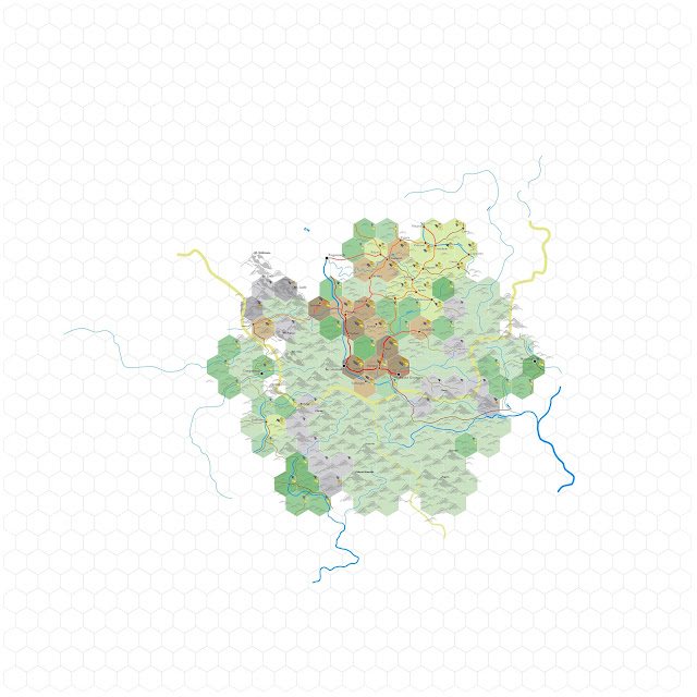
So, six months work:
This is the full map so far, at 43% zoom. Just gets bigger and bigger. There's quite a bit more above than I had the end of June. I rather like the effect of colour as the hexes begin to shrink and disappear, with the brighter patches being various shades of orange to tan. That large light splash in the middle left is Transylvania; the orange arc north of the big river, the Danube, is Wallachia; south of the river it's Silistra in Bulgaria. The light patch on the far left, just below centre, is Serbia; the light patch on the bottom right, along the sea, is Dobruja.
You can see from this that "nations" are less about boundaries and more about patches of density separated from elsewhere by forests and mountains. Intensely populated centres are important militarily and economically; small patches, like the two orange groups in the upper right that represent Bukovina and Moldavia, matter locally but are mere satellites.
I have begun to place additional labels on rivers and mountains, but I'm still playing with colours for these things. The map is so dense that there's little room to draw in large letters defining "Serbia" or "Transylvania." I'm also beginning to feel that the boundaries need darkening, to a colour that's a deeper yellowish-brown or orange, that offer a better definition. Not sure yet which way I'll go.
Posting the map in 100% of it's zoom now requires six plates. Moving from west to east across the top of the map, and then from west to east across the bottom, this is Plate 1. Moving clockwise from the top, Ruthenia, West Transylvania, Bidin in Bulgaria, the Banat.
Plate 4. Southwest Transylvania, Bidin, upper and lower Serbia, the Banat.
Plate 5. Southeast Transylvania, Wallachia, Silistra, Oltenia.
Plate 6. Ismailia, Black Sea and the Lower Danube, Dobruja, Silistra and east Wallachia.
By virtue of the method I'm using of going round and round the outside rim, I find myself reposting content that's already been posted. I suppose this is somewhat boring for the reader. I'm hearing less and less interest in these maps and if the reader likes, I can centre on one corner a month rather than posting the whole thing each time. The map spreads out over eleven working sheets at this point and it would be easier for me to post the sheets as they're finished rather than trying to match them up. Still, it looks remarkable to me. I find myself gazing at parts from time to time as I'm working, startled by the slow, tremendous growth. The chaotic terrain of southern Serbia was, this month, both a trial and something of a revelation, as I've never viewed this part of the world in such deep detail. I can't imagine how difficult it was to invade and hold, for NATO forces, for the WW2 Germans or for the WW1 Austrians. The mountains roll every which way and have no continuity.
Please let me know if you're still anxious to see what next month's generation produces.
Thursday, June 30, 2022
Map, June 30, 2022
Wednesday, June 1, 2022
This is an Important Game Mechanic
"That's the GM's Regional Map from my AOWG. And it's a damned good regional map. It's not a good map for a Simple Homebrew Campaign. It does some s$&% wrong. I just want you to see what it looks like. Also, ignore the fact that it's got no labels. Pretend I labeled things.
"A GM's Regional Map is precise. A GM can — within three miles — plot the exact position of any f$&%ing thing anywhere in the world. A GM's Regional Map is mechanical. The world's broken down into chunks. Spaces. Six-mile hexes in this case. Thus a GM can easily plot movement and resolve actions without doing a lot of measuring and math. And that's important because the GM's Regional Map — along with a few supplemental notes — is used for running games. For adjudicating travel actions. It's for running games. At the table. Not for looking at."
— The Angry DM
I'm not going to rant.
Dear Reader, please take your time and look at the above's construction. Consider each sentence individually. Evaluate what it says. Decide if it says anything.
Informed Ability is a TV trope wherein a writer stresses the ability of a character or a thing excessively in an effort to make the viewer believe that by repeating these things the overall idea will be accepted as true. For example, if every cast member in at least half the TNG episodes tells us that Riker is "amazing," certainly that must be the case, otherwise why would all the characters believe it so thoroughly. Of course, there's no evidence from any episode that Riker's capable of doing more than the most ordinary Starfleet officer, but that's not what matters. What matters is how many times we tell you Riker's a darned good Starfleet officer. Because he is. I just said so.
Captain Obvious is a TV trope wherein the writer strives to engage the reader with interesting sounding exposition which, unfortunately, consists of information the audience already knows. For example, the way that a map works and what it's for. And that a fantasy map promoted by an RPG game blog is used for running games. On a table.
This is a map of Calgary, where I live. It's a damned good map of Calgary. It's not a good map for simple things. It does some shit wrong. I just want you to see what it looks like. Also, ignore the fact that it's got no labels. Pretend I labeled things.This map is precise. You can see, within three miles, the exact position of any fucking thing in Calgary. The map is mechanical. Calgary is broken down into chunks. Spaces. Six-mile hexes in this case. Thus you can easily plot movement in Calgary without doing a lot of measuring and math. And that's important, because THIS map of Calgary is used for running games. For adjudicating travel actions. It's not for looking at.
So everyone can see where I live, I put a dot in the hex which contains my house. This isn't to say the dot represents my actual house location. Only that the hex with the dot contains my house.
Given the precision of this map, you shouldn't have any trouble finding my front door.
P.S.
AOWG stands for "Angry Open-World Game." And here I thought it mean Angry Old White Guy.
Tuesday, May 31, 2022
The June Version
It should be evident that I'm pursuing the directions east and west more than north and south, because there is more east and west to the shape of the world. Thus the map is only 6 hexes higher but it's 12 hexes wider. The size of image is 55% of normal. It can be seen that I reached the Black Sea on the east, completed much of the Danube River's course and nearly completed the swamp around Dobruja. Much of the northeast corner now extends into the Ukraine, while the southwest is verging into Serbia. The heavily populated core of Transylvania is nearly enclosed; I think the map gives good evidence of how the region formed an isolated power-centre in European affairs, given that it's essentially a fortress between mountains.
Sunday, May 1, 2022
The May Version
Monday, March 14, 2022
Map Redux
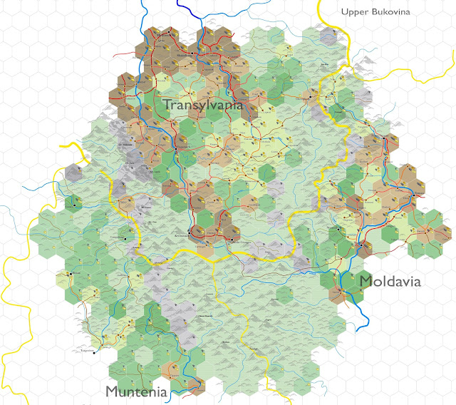
Initially, I'd intended just to map out a few circles of the 6-mile hexes surrounding Kronstadt. But as the maps became useful for the worldbuilding posts, I went on expanding the map in bits and pieces. Each time I posted these online, my views shot up, so I know readers are liking the maps.
Problems, however, were forming. The work was spreading outwards to the edges of the map sheet ... which meant my having to create new sheet, as my computer will handle only so much data. The Kronstadt map had reached a size of 33 megabytes; that's pretty big for a publisher file. This is why I present my 20-mile sheet maps in sizes of 30 by 35 hexes ... to keep the size manageable.
Additionally, the location of Kronstadt happens to fall near the 30th meridian, east. This is one of the points that my world map shifts 60-degrees in direction, to maintain the map's projection. As such, every map I've posted of Kronstadt this year has been shifted 60 degrees to the right, so that "north" is in the map's upper right. Since none of the actual 30th meridian passes through any of the map I've drawn thus far, I decided to shift the whole map to date to the left, to put north at the top. Here's the redux:
This has also been shifted onto two sheets, shown combined above. If I continue (and I think I will), the map's bound to spread out onto other sheets as it grows. I'm really liking the colour scheme; I saw no reason to change it.
I have changed the hammer symbol throughout. These changes are time-consuming ... but a little done each day produces results over time. Eventually, I catch myself up to the place I was at before deciding to reformat; this is always a very good feeling.
I'm going to write a post about way stations and shrines in the next day or two. I'm feeling a lot better, by the way.
Monday, February 28, 2022
The Work So Far
Feels a bit like I'm milking this, but I've had such positive respons for the maps that I feel it's useful to provide updates when they occur. Now and then, I find some time to expand it, moving in a clockwise circle as I go. This is the 6-mile map again: 6.67 miles per hex.
I find it easy to stare at.
The reader should be able to see now the density of Transylvania in the upper left, and the core of Moldavia forming on the right. Muntenia's density happens off the bottom of the map, as the Danube River is approached.
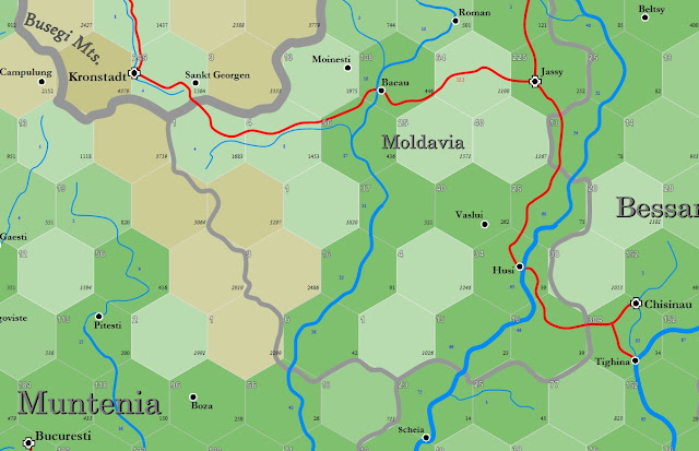
For those who might see and wonder, the "3" that appears in the Shassburg hex was an accidental copied cell. There's a "1" underneath the 3 that can barely be seen. I've fixed it.
Friday, February 11, 2022
Thursday, February 10, 2022
Interlude
Monday, January 31, 2022
Agder Redone
Once again I find myself messing around with colour schemes for my 6-mile hex maps. Most maps on this wiki have 20-mile hexes, but I also build maps that "zoom in." Recently on my wiki, I posted such a map of Agder, a county in southern Norway. I wasn't especially pleased with how it looked on the wiki, so I spent some time making adjustments to the icons and the general appearance. The result is this:
The above includes Agder and a larger area surrounding it; opening the image in its own window should provide a clear detailed picture, as I saved this in 300 dpi.
I'm still not sure. The mountain repetition looks a bit processed, but then there's nothing necessarily wrong with that. I do like the colour scheme for the larger, more important cities; they're in shades of brown. But overall, I'm posting this to make the point — outside the series I'm writing — often demands a new look at old work. It's not a straight line. This is, I think, my fourth version of a 6-mile hex map, and still I'm looking at it and wanting to change the border colour.
At least, it doesn't look heavy-handed. With maps, I find, muted variations often look better than primary colours.
Anyway, no, there's no key to the above as yet. White country is pure mountain rock with little vegetation, the bluish-purple is shield country, interspersed with stunted and very thin pine trees, while the various greens indicate semi-arable and arable lands. Darker colours are more populated and possess more activity (hammers), wealth (coins) and farming (bread).
Friday, May 15, 2020
Greater Turkestan
Monday, February 18, 2019
The Oirot Homeland
The above represents some work I put in this last December, where I managed to add the two small provinces of Oirad and Torghut, which can be found to the center right of the map. Both comprise a tiny corner of China ~ and the center of the Oirot or Dzungarian power that ruled this part of the world for some four centuries (post Mongols up to the late 18th century).
Putting together the research, the change in color scheme to represent the desert, sorting out the mess of what were mountains, plains and river courses, this ended up being about 40-50 hours of work. Whereupon I quit in disgust. I'm not that happy with the color scheme, which tends to meld together making it difficult to discern one element from the next. I cannot seem to improve upon it without either creating either a garish look or obscuring the hexes beyond use as hexes. The research was a bitch; what little there is consists of conflicting reports that disagree about dates, borders, the existence and names of places, the actual location of deserts and a hodgepodge of other details that ~ for the time, broke me. I haven't even been able to look at this long enough to post it.
I get that both China and Russia would both want to keep this region they share in absolute, total obscurity. China reports every city on the border here as having at least half a million people, even a million or more ... which is simply ludicrous. Russian sources are worse, being both inconsistent and plainly lying about the height, location and number of mountains, lakes and routes. All this on top of the topography itself being about as chaotic as any place I've found. This has to be the most annoying part of the world I've ever mapped ~ including my bitching about Tibet in 2017.
Of late I have not done much mapmaking. I lost much of 2017 due to the steady demise of my laptop at that time, and most of 2018 because I foolishly signed up for Windows 10 version of Publisher, which made working with images of this side flatly impossible. I do hope to do more mapmaking this year, but I admit it isn't high on my motivation scale. Digging back into this mess above promises to be no picnic, sorting out more of China and then Mongolia, that mess of pink empty hexes on the far right.
For those unfamiliar with my map-making practices, the pink hexes are roughed in civilized regions that haven't been mapped, the white hexes are those for which I have zero information, the circles, arrows and dotted lines are guidelines for elevation, river courses and other imaging ... all of which is designed so that if I drop a map for five years, I can step back in and remember what the hell I was doing the last time I was mapping this place.
I have to admit; I miss mapping Africa. Africa made a lot more sense than this place.
I'm just whining, right? Yeah, that ... that's probably fair.


.png)