Experimenting with colour changes:

Preferential in some ways; the wilderness stands out better, though it minimizes the appearance of the mountains when looking at the whole map. Close up, the information is there:
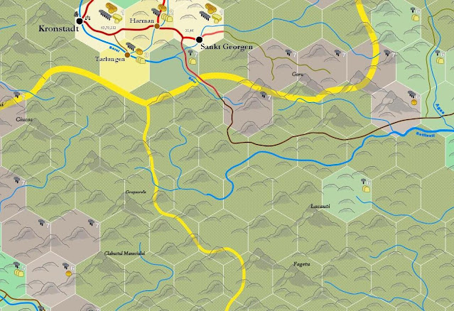
The change was meant to make the more civilised areas more lightly coloured. The problem is, as we go progressively towards wilderness, the colours get darker and darker (maintaining contrast), and the larger part of most maps are uncivilised. The result is a dark map. If I lighten up the wilderness, then everything else also has to be lightened in turn, and steadily the contrast between each level of hex diminishes. It's tricky.
UPDATE:
From March 3rd, a newer version than last night (with slightly more map added):
I'd advise against this particular color scheme. Generally darker colors represent more density, and lighter colors scarcity. This even applies to traditional dnd maps; tans and yellows generally represent desert(no vegetation), and dark greens forest(dense vegetation). In single color chloropleth maps(population density, crime rates, Disease, etc)
ReplyDeletethe darker colors are always assumed by the map reader to be greater in quantity of whatever is represented, even if the legend says different(there are studies about the impact of color on maps that verify this). So with what you presented the general assumption might be that the lighter colored areas should have less settlements than they do. Though this all depends on what you are representing and the individual reader, map presentation can be very finicky. Try to avoid presenting too much information at once, I know it's a hard impulse to avoid for those of us who want to see every little detail, but less is more for maps(in most cases).
I think that this could work, but the mountains are hard to see - if the mountain symbols could be lightened, that might work, but it also might look awful. Hard to know without changing the file.
ReplyDeleteI agree wholeheartedly. I'll put up another version that I started working on this morning, where the colours have been minutely lightened and yet it makes a big difference.
ReplyDeleteI hear what you say about deserts, but I'm thinking in terms of "green forest" and "not green forest." Fields and wattled houses are lighter in colour and less green. I don't like that the wilderness was formerly lighter than the fields of types "5" and "4", or the excessive way the dark browns of the more infrastructured area draws the eye. On the whole, I want a semi-dark "foreboding" wilderness and an open, easy-to-see civilised hexes, with a steady lightening from the former to the latter.
I may continue to tweak it, but for the moment I feel more satisfied than I did last night, and much more than I did when I commenced the colour change.
Adding the newest version from March 3rd on the post above right now.
It is an improvement :)
ReplyDeleteAgreed, KingstanII. Tell me how the mountains look with the moderated version I just added above.
ReplyDeleteIt's definitely better. Mountains are much clearer and less muddy than before.
ReplyDeleteI also think that the overall presentation is clear - the presence of roads and symbols reinforce the idea of the inhabited regions as being inhabited. It almost makes the yellow areas look like wheat fields, which is a nice effect.
ReplyDeleteDefinitely what I was going for.
ReplyDelete