Some of you may already be aware that I had a computer crash on me last month ... which totally sucks. I'm sure everyone can agree on that. One of the things affected was my maps; which I am now in the process of remaking, using an upgraded program. This new program offers me some nice choices ... but certain effects are more difficult to create, which means I've been messing about with color schemes and such, to improve the general appearance.
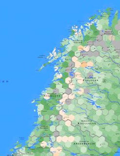
I've finished one section of Norway and Sweden - the central peninsula - and I thought I'd ask how it looks in comparison with the old version.
Here's what it used to look like (better view here):
And here is what it looks like now:
I really don't know. I don't like the new colors - but I don't know why I don't like the new colors. I don't know if its because they don't blend well or they're too bright or something. My partner says she likes the new look because its brighter and colorful, and because the borders are much more evident. It could be the whole map looks more intense just because of the borders ... but she's right. They are easier to see now.
Well, it's the internet, so lets pick a little bone. Tell me what you think.

.jpg)
I'd say that the bottom map looks better. The colors flow better, one into another. the top has those abrupt dark grey hexes which are somewhat jarring in comparison. And the organe borders, yeah, they pop out a heck of a lot better.
ReplyDeleteI would guess, however, that the top map, it's easier to determine the type of hex against a key, due to the more abrupt color transitions, but I can't quite tell due to the sizing.
- Ark
It's probably just human nature. I'd venture to guess that it's the change itself you find disagreeable, in which case, over time, you'll become accustomed to it.
ReplyDeleteSorry Ark. You can get a better look at the old copy here:
ReplyDeletehttp://www.thesameuniversewiki.org/B%2001%20-%20Lofoten.ashx
The blue used for inland bodies of water is not to my liking on the new maps when compared to old. It's too... blue. But the rest of it looks fine. I really like what appears to be a new font used for the region titles.
ReplyDeleteAt a glance, the new map doesn't appear to convey the same information as the original. Something like the sense of the underlying geography (ie: the river valleys) has been partially lost?
ReplyDeleteBut I'll echo what Andrej said about the inland waters, and add that adjusting the hue or tone of the deepest green hexes might give you some satisfaction.
I feel the top one gives a sense of "oldness". The muted colors and the font makes me think of dwarven kings and game of thrones. The same muted colors and the way rivers and oceans have the same color, also gives a measure of realness to the map. Like its a satellite photo, with the names and borders placed on top.
ReplyDeleteThe bottom one seems more like a map I might find in an Atlas. Bright colors, easy to see borders, uninspiring font (IMHO).
All in all, I prefer the top one.